
The Blueprint of Fear Before the First Shadow Falls
Suspense often begins before a character speaks, before a door opens, and before the audience knows what danger to expect. A frame can make the body tense through proportion alone. A ceiling presses downward, a corridor narrows toward darkness, or a doorway sits just far enough from the center to make the surrounding wall feel watchful. These details act on the autonomic nervous system, producing alertness before the story has supplied a conscious reason for fear.
Human spatial cognition is built around practical questions. Where is the exit? What lies beyond that obstruction? Which route is open, and which blind spot could conceal a threat? Cinema turns those everyday calculations into instruments of dread. The viewer is constantly measuring distance, height, depth, and visibility, often without realizing it. Architecture becomes frightening when it frustrates the instinctive search for safety.
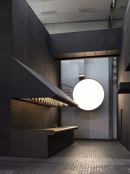
Directors and production designers exploit this unease through oppressive verticality, broken symmetry, blocked sightlines, and corridor dynamics. The result is an unspoken emotional contract between the built environment and the viewer. The set promises that space will behave according to recognizable rules, then quietly violates those rules. Long before plot contrivances reveal peril, geometry has already taught the audience to distrust the room.
Vanishing Points and the Illusion of Safe Passage
A corridor is rarely just a way from one room to another in suspense cinema. Its lines gather the eye and force attention toward a vanishing point, creating the sensation that the viewer is being pulled into a space that cannot yet be read. One-point perspective is especially powerful because it organizes the image with apparent certainty. Walls, ceiling, floor, and repeated fixtures all seem to agree on a destination, yet that destination may conceal a person, an opening, or nothing at all.
Exaggerated linear perspective turns distance into pressure. The longer the corridor, the more the unseen end begins to feel like an appointment with danger. A wide landscape can offer several possible routes and allow the eye to roam, while an architectural funnel reduces choice. The viewer may see a path forward, but the image quietly removes the possibility of turning aside. This is why a seemingly safe passage can feel more threatening than an explicitly dark room.
Gestalt principles help explain the mechanism. Viewers group repeated elements, follow continuation, distinguish figure from ground, and complete forms that remain partially hidden. Composition and lighting guide attention toward the elements that matter, but suspense arises when the image directs attention toward a space that withholds confirmation. Scholarly examinations such as Christine Madrid French”s The Architecture of Suspense highlight how physical environments define emotional stakes rather than serving as passive decoration. In Hitchcock”s cinema, enclosed rooms, urban structures, roadside buildings, and modernist houses do not merely contain action. They frame uncertainty and make the characters” psychological condition visible.
- Open vistas distribute attention and suggest multiple escape routes, even when danger may be visible in the distance.
- Narrow corridors concentrate attention and make forward movement feel compulsory.
- Repeated architectural units create rhythm, but repetition can also erase orientation and make every doorway appear identical.
- Occluded vanishing points promise information while withholding it, turning visual expectation into anxiety.
The most effective spatial suspense does not require a figure to appear at the end of the corridor. The possibility is enough. A vanishing point becomes a psychological trap because the viewer”s own act of looking seems to move toward the threat. Safe passage is revealed as an illusion created by perspective itself.
Claustrophobia and the Tyranny of Low Ceilings
Claustrophobia in film is not simply a matter of placing characters in a small room. It is a relationship between the body and its perceived options. A low ceiling compresses the vertical field, while horizontal sprawl can prevent movement without necessarily making the room physically tiny. A broad interior may feel inescapable when its exits are distant, blocked, or psychologically unavailable. The camera can intensify the effect by crowding faces, clipping bodies at the edge of the frame, or making walls appear to advance.
Three elements repeatedly produce cinematic claustrophobia: closeness, entrapment, and threat. The first concerns physical proximity, including bodies forced together or objects placed uncomfortably near the lens. The second concerns the disappearance of viable escape. The third turns confinement into danger, whether the threat is another person, a memory, an unseen presence, or a character”s own deteriorating perception. An analysis of Alex Ross Perry”s Queen of Earth and Her Smell shows how framing, camera movement, editing, and sound can create confinement even when the setting is not uniformly small.
Queen of Earth is particularly revealing because its holiday setting appears spacious and idyllic. Yet tight close-ups, bordered compositions, disturbing sound, and an ominous score transform open landscape into a psychological enclosure. Catherine”s grief, paranoia, and hostility toward Virginia make space feel less like shelter than a sealed chamber. By contrast, Her Smell gradually moves from claustrophobic intensity toward intimacy, allowing a stylistic shift to register the possibility of escape from a destructive psychological prison.
| Spatial feature | Viewer response | Suspense function |
|---|---|---|
| Low ceiling | Somatic pressure and reduced vertical freedom | Suggests compression, exhaustion, or impending collapse |
| Wide room with distant exits | Exposure combined with poor escape access | Makes the character visible but not necessarily safe |
| Tight close-up | Loss of bodily and visual distance | Turns expression into an enclosed psychological landscape |
| Blocked windows or doorways | Frustrated orientation | Converts possible exits into reminders of entrapment |
| Open-plan interior | Surveillance and lack of privacy | Allows threat to emerge from any direction |
Production design can also make openness feel sinister. The lake house in Verity, a property shaped by an inverted V roof, exposed beams, expansive windows, and natural materials, offers room for movement while producing shadows, voyeurism, and uneasy visibility. Space does not have to crush the body to unsettle it. Sometimes the threat lies in having nowhere to hide.
Asymmetry and the Uncanny Violation of Thresholds
Symmetry offers reassurance because it helps the eye predict how an environment is organized. Doors align with walls, rooms appear balanced, and the frame seems to confirm that the world has a stable center. Asymmetry interrupts that confidence. An off-center doorway, an irregular room proportion, or a figure placed against an unusually empty section of the image can make an ordinary interior feel subtly incorrect. The viewer may not identify the disturbance, but the perceptual system registers that the visual field is refusing easy resolution.
Thresholds are especially potent because they mark transitions between known and unknown spaces. A doorway, stairwell, elevator, hallway, or window promises movement from one condition to another. Suspense emerges when the threshold does not clarify what lies beyond it. In liminal spaces, ordinary intuition loses its authority. The viewer knows how a room should connect to another room, yet the image makes that connection feel unstable, delayed, or hostile.
Personal Shopper relies on this estrangement more than on continuous physical confrontation. Maureen moves through apartments, hotel rooms, streets, and transitional interiors while trying to determine whether communication with her dead twin is possible. Empty spaces become active because the film refuses to keep the supernatural neatly separated from ordinary experience. Unexplained texts, offscreen sounds, and uncertain presences make architecture feel permeable. Critical readings of supernatural suspense in Personal Shopper and Let the Right One In show how off-centered framing, editing, sound, and architectural thresholds direct attention toward what remains unseen.
- Establish the familiar threshold. Begin with a recognizable doorway, corridor, or domestic room so the viewer develops expectations about how the space should function.
- Displace the center. Move the subject away from visual balance or leave an emphatic area of empty space beside the character.
- Delay confirmation. Use sound, editing, or offscreen action to suggest that something has crossed the threshold without showing exactly what it is.
- Allow ambiguity to persist. Refuse to restore the room to complete visual or narrative certainty, keeping the viewer aligned with the protagonist”s uncertainty.
This is the architecture of the uncanny: not a spectacular violation of physical law, but a subtle failure of spatial trust. In Let the Right One In, trees, snow, framing, and sound similarly turn ordinary environments into zones of isolation and risk. The supernatural becomes convincing because it invades spaces that are otherwise familiar. Dread grows in the gap between what a place promises and what the body senses.
The Corporate Labyrinth and Inescapable Junkspace
Gothic cinema once located dread in castles, crypts, and ancestral houses. Contemporary suspense increasingly finds it in fluorescent corridors, empty offices, aging retail interiors, and standardized rooms whose very banality becomes disturbing. These environments lack the expressive personality of a traditional haunted mansion. Their horror comes from repetition, replaceability, and the suspicion that no one designed them for human comfort. They are spaces built for circulation, storage, supervision, or transaction, not belonging.
The online fascination with liminal spaces has given this anxiety a recognizable visual language. Yellowed lights, patterned carpet, blank walls, abandoned food courts, and office furniture from an uncertain decade create a world that feels both familiar and unreachable. The concept of junkspace, associated with generic and continuously connected built environments, captures the fear of being lost inside architecture that has no meaningful center. A corridor does not lead home; it leads to another corridor.
Modern production design repurposes banal office layouts into engines of paranoia. The corporate maze can erase individuality through identical workstations and endless white hallways, while surveillance becomes architectural rather than merely technological. In spaces associated with corporate control, the absence of decoration is not neutral. It suggests that personal memory, privacy, and even time have been removed from the environment.
- Repetition destroys orientation by making every room appear interchangeable.
- Fluorescent lighting eliminates comforting shadows while producing a harsh, sleepless atmosphere.
- Standardized furniture implies institutional control and the disposability of individual occupants.
- Empty public interiors preserve signs of ordinary activity without providing the people who would make the space feel safe.
- Digital liminality extends architectural unease into virtual environments, where an interface or game world can become an apparently endless maze.
The production challenges of bringing virtual liminal imagery into physical space reveal why these settings remain so compelling. A digital maze can generate endless repetition, but a physical set must create variation without losing the sense of sameness. Furniture, wallpaper, lighting, and slight changes in proportion become crucial. The architecture must feel generic enough to be familiar and specific enough to sustain dread. That tension transforms the office into a modern haunted house, one whose ghost is not necessarily supernatural but structural: the fear of being absorbed by systems too large to understand.
Rewiring How We Inhabit the Frame
Spatial geometry is not an ornamental layer added after the story. It is one of cinema”s foundational systems of meaning. Perspective determines where the eye is compelled to travel. Proportion determines whether the body feels protected or exposed. Symmetry offers order, while asymmetry introduces doubt. Thresholds promise passage, and corridors turn movement into an encounter with the unseen. Through these devices, architecture can create suspense before plot, dialogue, or visual effects have provided a conscious explanation.
The most enduring spatial dread lingers because it becomes physical knowledge. A scripted line can be remembered as information, but the memory of a narrowing hallway or an empty doorway operates closer to sensation. The next time you watch a suspense film, study the set as a calculated emotional battleground. Notice which exits remain visible, where the frame places its empty space, how ceilings and walls regulate the body, and whether the room confirms or undermines your expectations. The architecture is already telling you how to feel.